Flutter Particle Clock
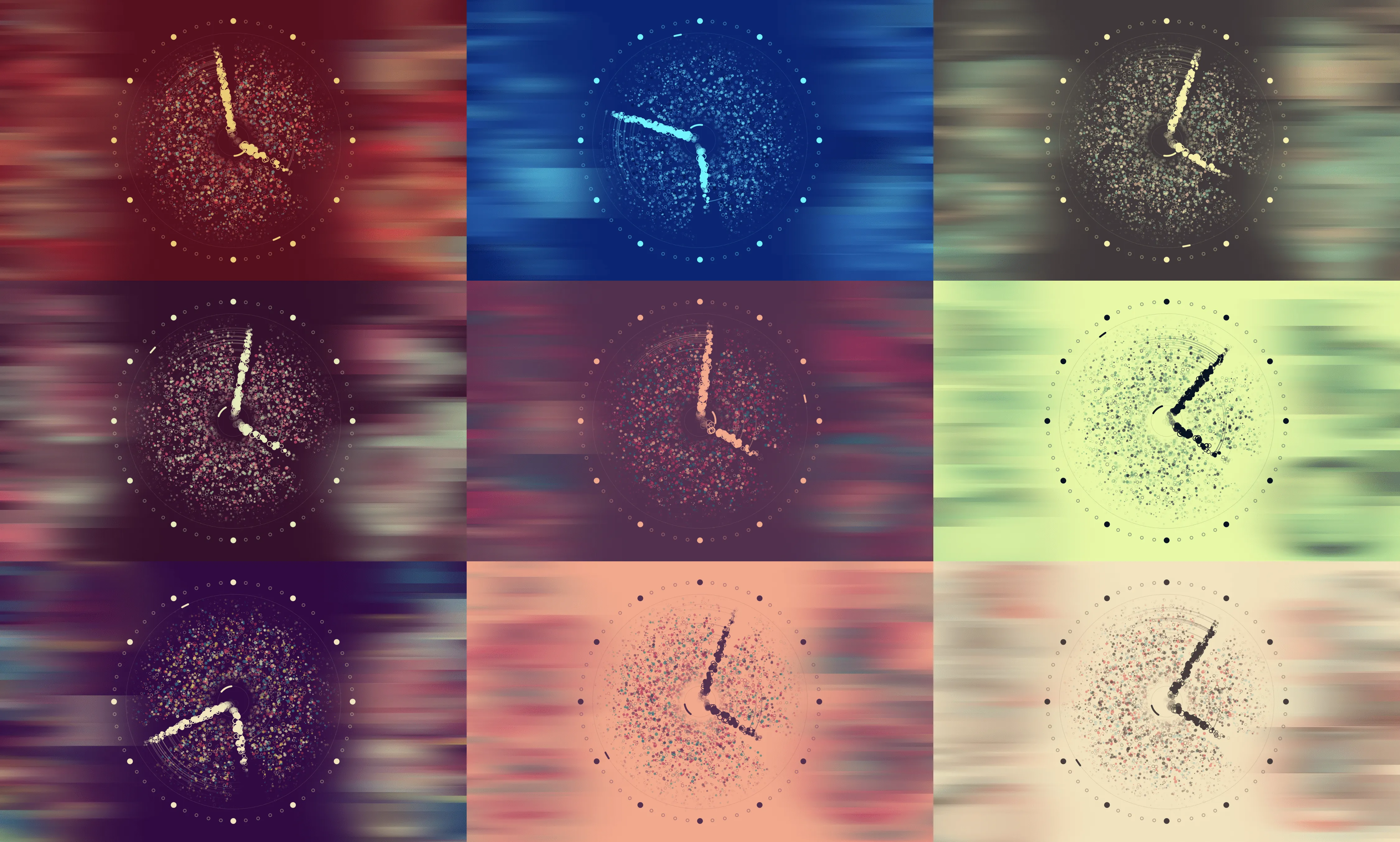
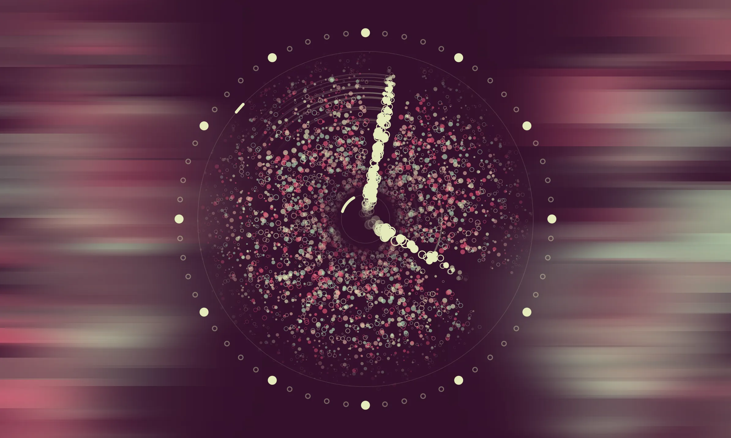
The Flutter Particle Clock is my award-winning entry to Google’s Flutter Clock Challenge—a unique competition inviting developers to design innovative clocks using the Flutter UI toolkit. What makes this project special is its dynamic, analog clock face composed entirely of moving particles, blending art and technology in a seamless way.
Google announced The Flutter Clock Challenge on November 18, 2019, following a mysterious countdown timer on flutter.dev that ended at 00:00:00. The challenge was straightforward: create a clock using Flutter, judged on four key criteria—visual beauty, originality, code quality, and overall execution.
With only limited prior experience in Flutter, I saw this as a perfect opportunity to deepen my skills. The result was an analog clock made entirely of particles that move and shift constantly, making it both functional and mesmerizing.
See also: How I Created a Particle Clock and Won the #FlutterClock Challenge
Feature Highlights
Designed to run smoothly on modern devices with 5:3 screen ratios, the clock offers:
- Automatic selection of color palettes that maintain legibility at all times.
- Support for both light mode and dark mode, triggered by ambient room brightness.
- Responsive scaling that adjusts calculations and rendering to fit the available screen space.
- Consistent rendering at 60+ FPS on modern devices.
- Continuous motion and shifting, making it a joy to watch.


The Flutter Clock Contest Results were announced on February 25th, 2020. Out of 850 unique submissions from 86 countries, my Particle Clock was selected as the grand prize winner.
Judges were in awe from the visual effect, execution, code quality and overall novelty of this clock. The mathematical complexity of particle calculation was impressive.
This open-source project is licensed under MIT.